PROJECT BriefIn 2022 TWU Athletics wanted to update their branding for the 15th Annual Pioneer Power Sprint. The previous branding was outdated and did not reflect new branding for TWU and the Athletics department. They wanted a streamlined logo that still reflected the three events and utilised their custom typeface.
BRANDINGRebranding the Pioneer Power Sprint began with a new logo. This logo would be used in online marketing, printed on apparel and used as the basis for the medals given to the atlethetes participating in the event. For the inital logo exploration we experimented with movement, badge designs and geometric shapes.
Athletics decided to go with a logo that utilized both geometric shapes and movement. Icons representing the three events were paired with the TWU logo and the custom Athletics font to create a logo that could be updated annually. Various color combinations using TWU's iconic maroon, grey and white were created to work on various colored backgrounds. TYPEFACEIn 2017 TWU rebranded with new logos, brand colors and a new mascot. As part of that rebrand a custom typeface was created for the Athletics department. Unfortunately the typeface was limited to only half of the characters of the alphabet. Using Fontself Maker for Adobe Illustrator and the initial typeface characters we designed the remaining characters, punctuation and special characters needed to complete the typeface.
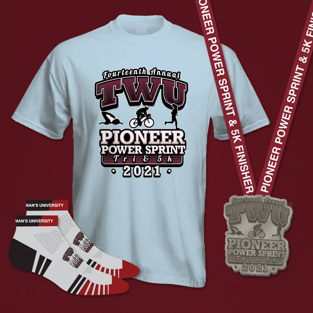
DELIVERABLESWhile the logo remains consistent year to year, it is updated for each annual event. The logo is used primarily for the medals, t-shirts and socks given out to the triathlon athletes.
The main marketing designs change every year. The designs use photographs from previous years participants and utilize TWU's branding to create coherent marketing. Posters, flyers, social media pieces and digital kiosk pieces are created from the initial designs to promote the event in various locations. 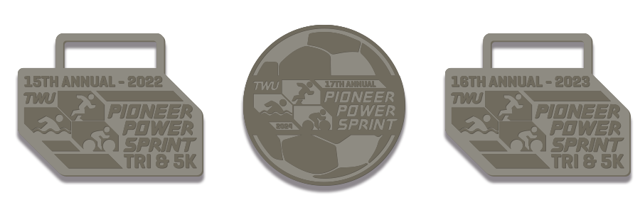
Medal Designs
|
Old Branding
Logo Exploration
New Logo
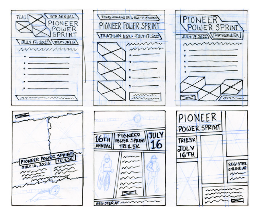
Initial Sketches
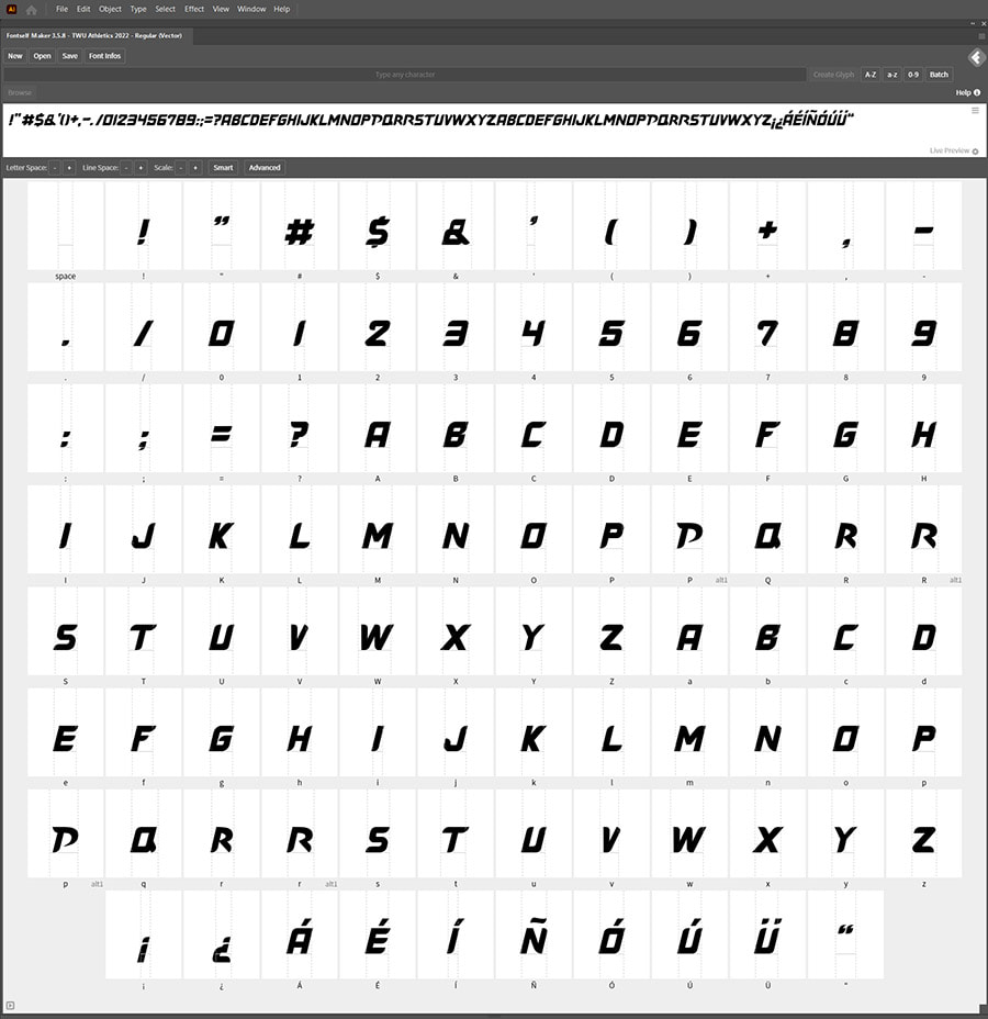
Typeface
|
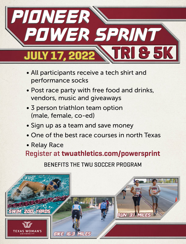
2022 Design
|
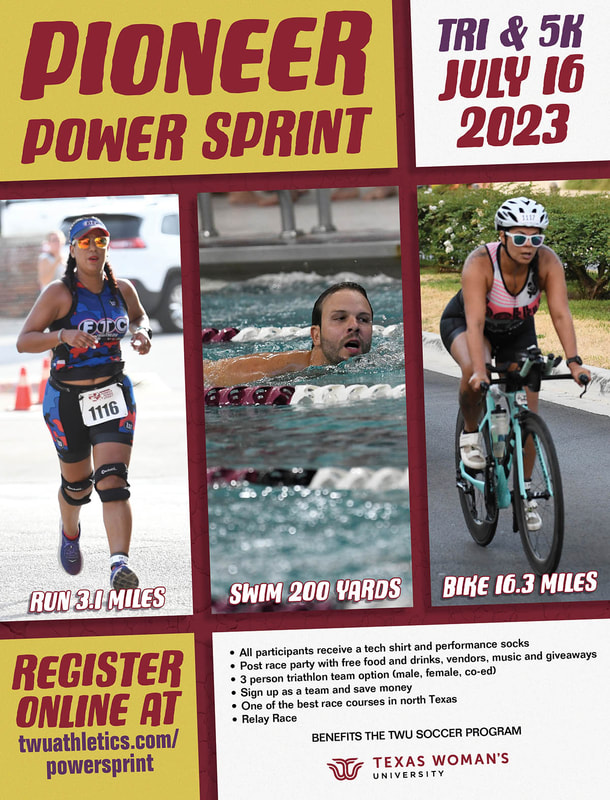
2023 Design
|
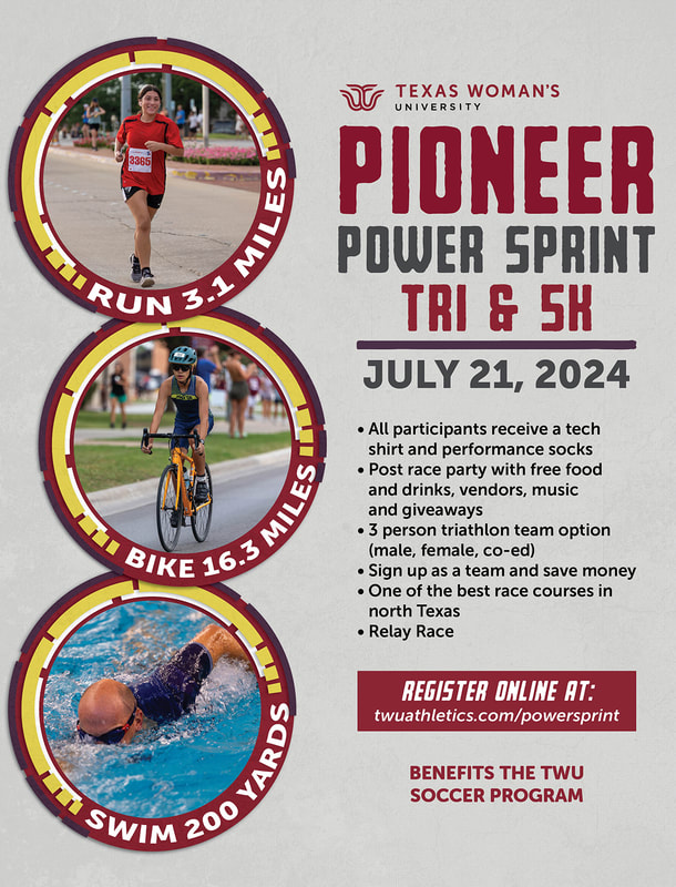
2024 Design
|


